
MOONFACE | TO CELEBRATE THE MOON FESTIVAL
A typeface inspired by the shape of the moon.

The idea
As the notion of community and resiliency is becoming even more important in post-pandemic context - we have created MoonFace on the occasion of the Moon Festival (one of the most important Festival of the year in China - the full moon having a symbolism of togetherness).
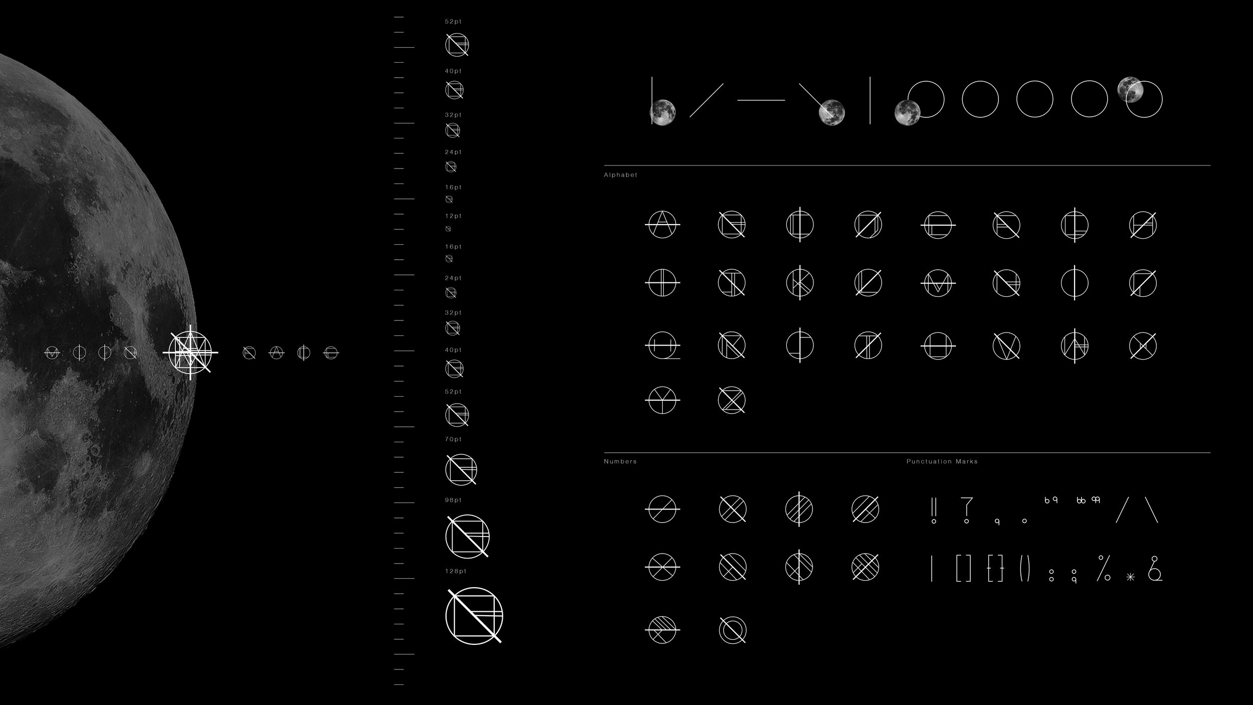
MoonFace is a typeface inspired by the shape and the rotation of the moon. It includes 26 letters, 10 numbers and 20 punctuations. Each letter is surrounded by a circle to indicate the complete state of the moon, and the changing axis is a representation of its rotation and the infinite angles behind it.
A way to remind us that just like the moon, we have the power to shift and refresh ourselves in a cyclical process.
Starting with words, aiming for the moon.


Selected Press
Campaign (UK) - Inspiration Station - Communicating by the moon
Latin Spots (Argentina) - Fred & Farid Crea Moonface Inspirado En La Forma y La Rotación De La Luna
CBNews (France) - Fred & Farid Shanghai crée Sa Police De Caractères Pour La Fête De La Lune
Brands News (Italia) - Fred & Farid Celebra Il Moon Festival Con Un Nuovo Carattere Tipografico
Sign (NL) - Ontwerpbureau creëert maanschrift

Credits
Agency: Fred & Farid Shanghai
Title of work: Moonface
Chief Creative Officers: Fred & Farid
Executive Creative Director: Feng Huang
Creative Director: Adrien Goris
Art Director: Billy Liao
Typeface Designer: Billy Liao
Copywriters: Adrien Goris, Billy Liao
Agency Producers: Charles Renard, Caroline Wei
Packaging Company: Xuan Mei - Shanghai Beauty Printing Technology & co, ltd